My Work.
Below are a few of my pieces that I have created throughout the past year. I am proud of my work and how far I have come since I started designing and I think it shows through my work. Please feel free to contact me with any questions or feedback on my designs.
|
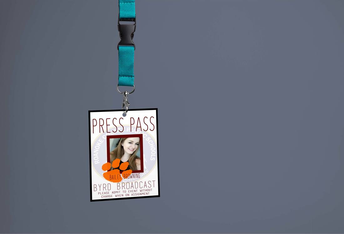
Press Pass
Created in: Photoshop & InDesign This is one of my designs for a press pass for the Byrd Broadcast team. I like my use of different transparencies and related colors that contrast each other and tie the design together. There’s also the use of proximity when arranging the in formation on the pass. This design taught me how to collaborate in more than one program to complete a design. If I were to change something about my design, I would probably use a more readable font (thicker). |
|
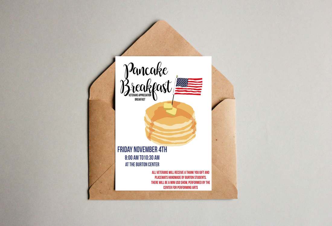
Veteran's Day Breakfast Invite
Created in: Photoshop This took me a while to create;specifically the pancakes.I utilized repetition of colors and contrasting fonts in this design. I used a blockier font juxtaposed to a cursive, flowy font which I think added a lot to the flyer/ invitation.This is yet another design that could’ve benefitted from the use of Adobe Illustrator.This being said, this project helped me to better learn to create illustrations within photoshop.I like the results of this project, probably because I managed to create the design without it looking far too “cartoon-ish”. |
|
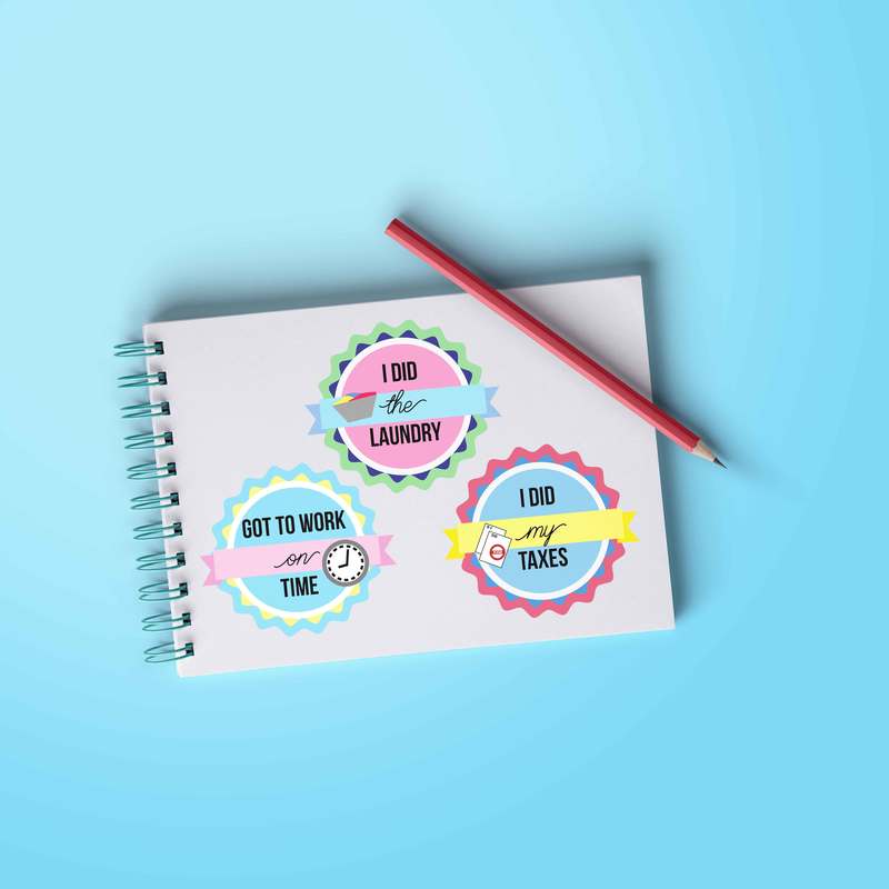
"Adulting" Badges
Created in: Illustrator These were badges I designed for my adobe class. I chose to go with the adult chores theme. It’s a way to award achievements for things like paying taxes and doing laundry.This project helped me to better understand the shape tools in Illustrator. I used principles like repetition and contrasting colors to create this series of badges. It I could’ve gone about this project differently, I probably would’ve made the badges themselves more elaborate, but I’m happy with this design overall. |
|
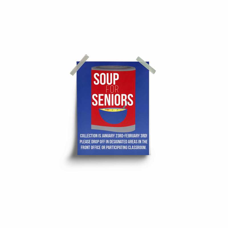
Soup for Seniors Flyer
Created in: Illustrator I designed this as a flyer for the Soup for Seniors charity thing.I went with a simplistic soup can design. I used alignment and repetition of colors to tie everything together.I think my design is fun and I really like the way it turned out but I feel like if I were to redo it I would probably be more aware of the spacing and therefore leave myself room for additional info within the design. This is also what this design taught me: to plan out the content of the flyer before designing. |
|
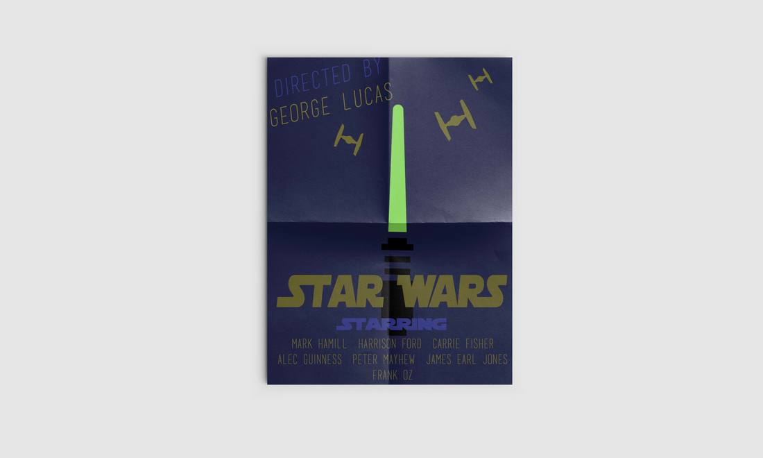
"Star Wars" Minimalist Poster
Created in: Photoshop & Illustrator This was my first design in this class so it was definitely a design that taught me a lot of the basics and made me feel more comfortable with the program. I used a bunch of different tools to create this minimalist design. The colors I chose were used in contrast with each other and I think this design is one of the more aesthetically pleasing ones I have created.I also used the element of proximity to make the overall look of this poster come together without looking crammed into a space. If I could change anything about this design it would probably be to change some of the colors to make them contrast the dark background a little more. |
|
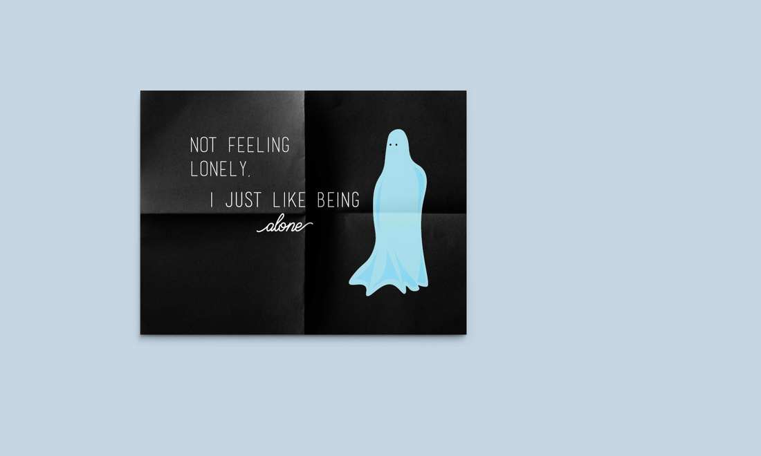
Modern Baseball Lyric Design
Created in: Illustrator I got bored on night while listening to music so I created this design. I used the bands designs for inspiration but also incorporated my own favorite fonts and design styles.I used contrasting fonts that I felt looked good together and I used contrast of colors and shades (light and dark). I also used the principle of proximity to add to this design and I felt like the spacing of the words and the ghost are what make the design work nicely as a whole. This design was one of the first I did for fun in Illustrator and it was really helpful in figuring out new methods of shaping figures in a design. If I could’ve done something differently, I would’ve changed the fonts and made them more aesthetic to the design. |
|
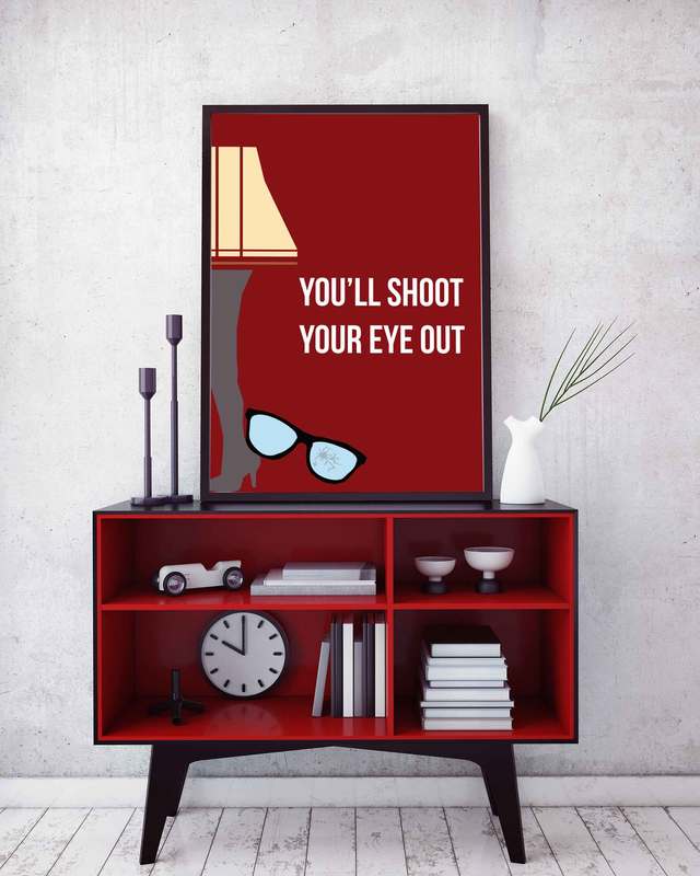
"A Christmas Story" Minimalist Poster
Created in: Illustrator I chose to create this poster design when completing an adobe certification course.This is one of my first designs in Illustrator so, needless to say, it was a learning experience. This helped me to learn the pen tool and style effects that could be used to add to the overall look of the design. I created this as a minimalist poster for the movie “A Christmas Story”. I used a mix of the pen tool and the shape effects to get the look of this design that I was going for.Two principles I used in this piece were contrasting colors and proximity within the design. If I were to have laid out this poster with its contents being too close together it would’ve taken away from the simplistic design.If I could’ve done something differently, I probably would’ve cleaned up some of the edges and made the lampshade more symmetrical. |
|
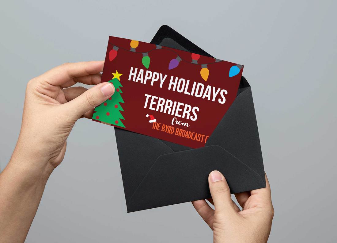
Byrd Broadcast Christmas Card
Created in: Illustrator I created this as a holiday themed piece to tweet on the Byrd Broadcast twitter account for winter break. In this design, I used the repetition of both contrasting and complimentary colors to created a visually interesting work. I also used the principle of alignment to space out the text properly. I learned how to properly copy and paste figures in this design without it looking tacky. If I were to do this differently, I would’ve made this into a .gif and make the Christmas lights blink. |
|
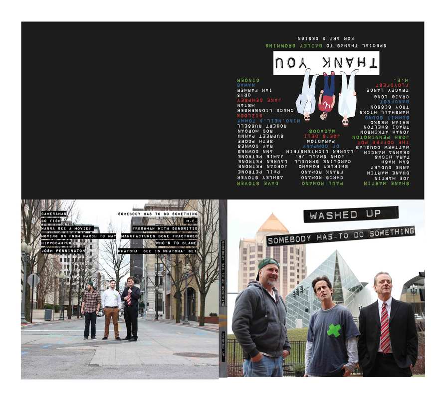
"Washed Up" Album Cover
Created in: Illustrator & Photoshop This is the album art I created for a local band's new album, "Somebody Has to do Something". Not only was I able to generate graphics for the band, but I also took the photos from the art work. They had a vision for this album in mind and I think it gave me a lot of valuable problem solving experience in the long run. |
|
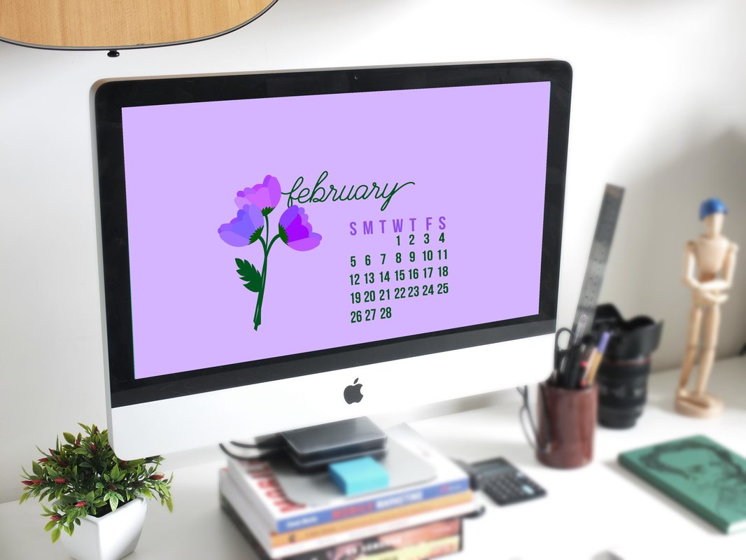
Desktop Calendar
Created in: Illustrator I used the pen tool to create flowers in shades of purple that still contrast with the purple background. I used purple instead of the classic pinks and reds that are usually associated with February and Valentines Day.Another design principle I incorporated was Alignment. Alignment was necessary to create a clean looking calendar and also while placing everything together. I decided to make this design into a desktop background for my laptop in an attempt to stay organized. This design became challenging when I got to the calendar part —what I learned from this was the importance of proper spacing/padding to make words and numbers more readable. And if I were given the opportunity to do something differently, I would probably either change my color scheme OR us a grid to create the calendar instead of just having the numbers in rows. |
